Willa Black Prints NZ - Styling Guide
Gallery Wall Art Ideas
11 ways to create rhythm, anchor a room and build a wall that says something about the people who live there.
A blank wall can make a room feel unfinished, but the wrong gallery wall can feel even worse - busy, random and oddly flat. The best gallery wall art ideas do more than fill space. They create rhythm, anchor a room and say something about the people who live there.
Build around one statement artwork
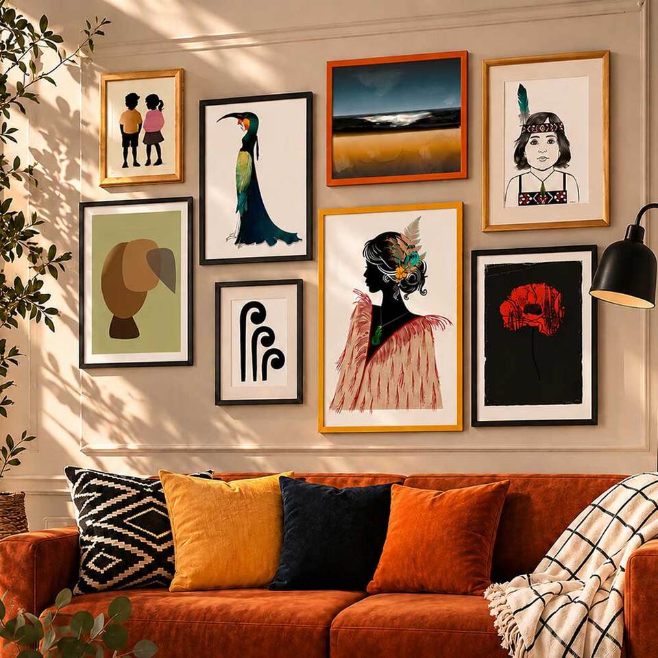
A gallery wall becomes stronger when one artwork clearly leads. That hero print gives the eye somewhere to land and stops the arrangement from feeling scattered. Start with the largest or most emotionally charged piece, then add smaller works that echo one element - perhaps the black frame, a muted earth tone, or a repeated line shape.
This works especially well with a bold abstract or a Maori-inspired piece with symbolic depth and graphic clarity. You do not need everything to match - you need enough connection to make the group feel intentional.
One hero print gives the eye somewhere to land and stops the arrangement feeling scattered.
Keep the palette tight, not identical
A gallery wall does not need one exact colour scheme, but it does need discipline. If every piece fights for attention, the wall will feel noisy. Black, white, sand, charcoal and soft green work beautifully in modern Australian and New Zealand homes because they sit well with timber, stone and natural fibres.
If you want more drama, bring in one deeper note such as rust, ink blue or forest green. The trick is repetition - when a colour appears in two or three places, the wall starts to hold together.
Best for: contemporary NZ and Australian homes with timber, stone and natural fibre interiors.
Mix subjects, keep a shared mood
Some of the best gallery walls combine different types of art - a landscape next to an abstract, a line-based print beside something textural. The trade-off is mood. Shared mood matters more than matching subject matter.
Choose the emotional lane first: calm, bold, grounded, minimal, dramatic. Then select art that lives comfortably inside it. If one work feels stark and architectural while another feels playful and pastel, the tension can be hard to resolve unless that contrast is deliberate.
Best for: collectors who want variety without visual chaos.
Use spacing as part of the design
People often obsess over what goes in the frames and forget the wall itself. Negative space is part of the composition. Tight spacing feels contemporary and confident. Wider gaps feel airy and relaxed.
As a rule, keep the gaps consistent. Uneven spacing is what usually makes a gallery wall feel accidental. In a compact nook, narrow spacing creates cohesion. On a long wall, a little more breathing room stops the work looking cramped.
Best for: any wall where the arrangement feels close to right but not quite landing.
Grid or organic - choose deliberately
If your room already has patterned rugs, open shelving or lots of furniture detail, a clean grid can be the better call. It gives structure and lets the artwork speak without visual clutter. Matching frame sizes create order fast.
An organic layout feels more personal when the collection includes works of different sizes or pieces with strong story and symbolism. The key is still balance - spread visual weight across the wall so one side does not feel heavy. Lay everything on the floor first.
Best for: busy rooms (grid) or personal collections with mixed sizes (organic).

"Styling can look good for a season. Meaning lasts. The most compelling gallery walls hold something more - a sense of place, memory, identity or connection." Willa Black Prints
Let the frames do quiet work
Frames can unify a mixed collection faster than almost anything else. Black frames create contrast and graphic strength. Oak or light timber softens the look and works beautifully with coastal, earthy or Scandinavian-influenced interiors. Matching every frame is the simplest route, but a mix of black and timber can work if the artworks share a similar tone. Too many finishes at once can cheapen the effect.
Scale up more than feels safe
One of the most common mistakes is choosing art that is too small. Go bigger than your first instinct, especially above a bed, sofa or sideboard. A gallery wall should relate to the furniture beneath it, not float like an afterthought. If combining sizes, let at least one or two pieces carry real scale - larger works give the arrangement authority.
Choose art with meaning, not filler
A gallery wall can be beautiful and still feel empty if every piece is there just to match the cushions. The most compelling walls hold something more - a sense of place, memory, identity or connection. That might mean landscapes that remind you of home, abstract prints that echo coastal light, or works rooted in Maori visual language and Aotearoa storytelling. Art with cultural and emotional depth changes the room. It becomes a conversation, not just decoration.
Think beyond the living room
Some of the strongest gallery wall art ideas work in spaces people usually neglect. Hallways are ideal for narrow vertical groupings. Staircases suit a gradual rise in frame placement that follows the line of the steps. Bedrooms benefit from softer, more spacious arrangements. Home offices are another underrated spot - a gallery wall behind a desk can create focus and identity, especially if the artwork is bold, monochrome or strongly graphic.
Make it easy to change over time
A gallery wall does not need to be fixed forever. You might begin with four pieces, then add one larger print later, or swap in a limited edition that deserves more prominence. Leave a little room to grow and choose a layout that can expand without becoming awkward. If buying made-to-order art, think about how future pieces might sit beside your current collection in both scale and frame finish.
Ask three questions before you buy
When in doubt, ask: does this piece add contrast, does it support the overall mood, and would I still want it if I moved house? If the answer is yes to all three, it probably belongs. For homes with a modern Australasian feel, artwork inspired by land, water, whakapapa and graphic symbolism can add depth without losing that clean, contemporary edge. A gallery wall should not feel like a decorating chore - it should feel like the room has finally said what it meant to say.
Willa Black Prints NZ
Build a wall worth living with.
Explore art prints inspired by Aotearoa, Maori design language and contemporary New Zealand interiors - made to order and shipped across NZ and Australia.
Explore the Collection